The Case Study

The Problem

Boutique realtor company needs an easy-to-use website/app for all demographics. Must include common market features while improving communication and accessibility.

Proposed Solution

Deliver a user-friendly, accessible web/app experience with instant communication options and inclusive settings.

Keep scrolling to see my process

Understanding the problem

Summary

Conducted an unofficial competitive audit to understand domain conventions and inform research. Interviews revealed frustrations with site flows and lack of direct human communication options.

Key Competitors

Zillow, Redfin, Zenlist

Overall Strengths

  • Nationwide listings
  • Good imagery & descriptions
  • Robust filtering

Overall Weaknesses

  • Confusing IA/flows
  • Not intuitive
  • Limited accessibility options

Opportunities

  • More equitable UX
  • Consistent navigation
  • Built-in accessibility
  • Guided user flows

Discovering pain points

Summary

Identified three core issues to drive design requirements.

  • Navigation: product-heavy layouts assume tech fluency; wayfinding suffers.
  • Communication: need clear, instant access to a real person.
  • Accessibility: housing is universal—must support varied needs.

Developing a Persona

Summary

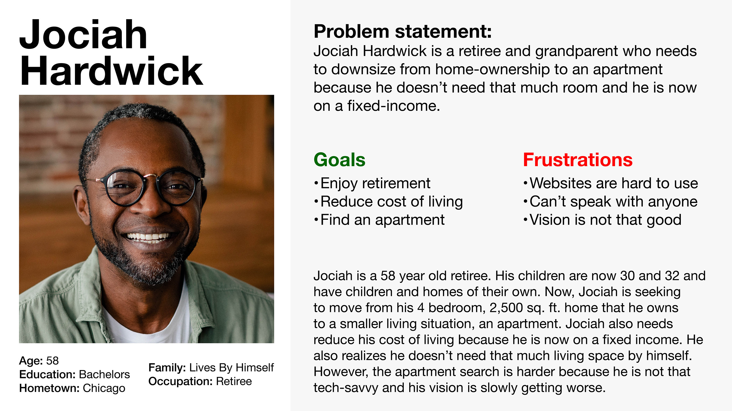
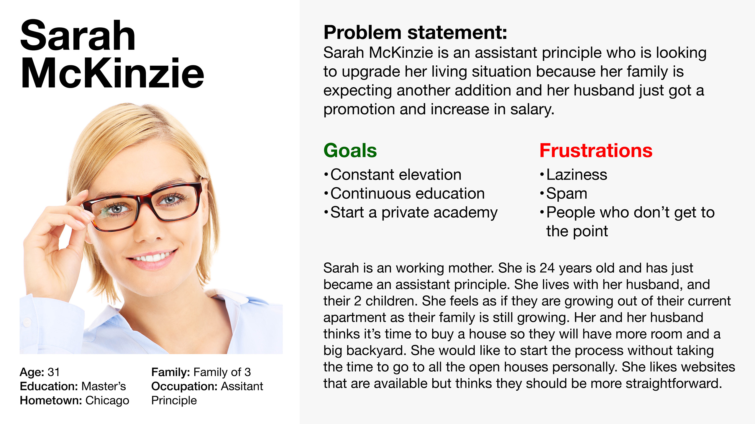
Two personas created to represent tested participant mindsets.

Persona 1 Persona 2

Sitemap

Summary

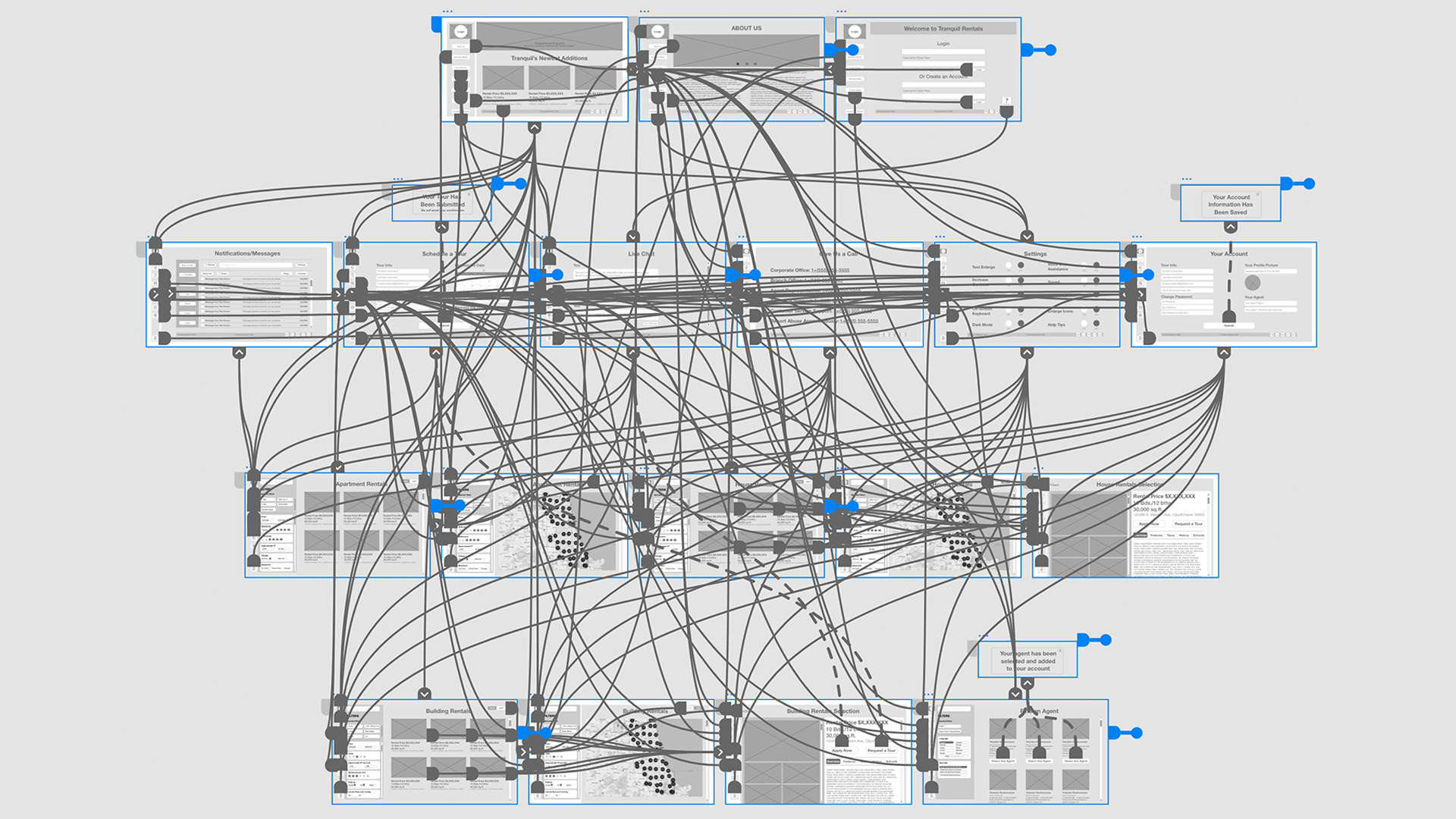
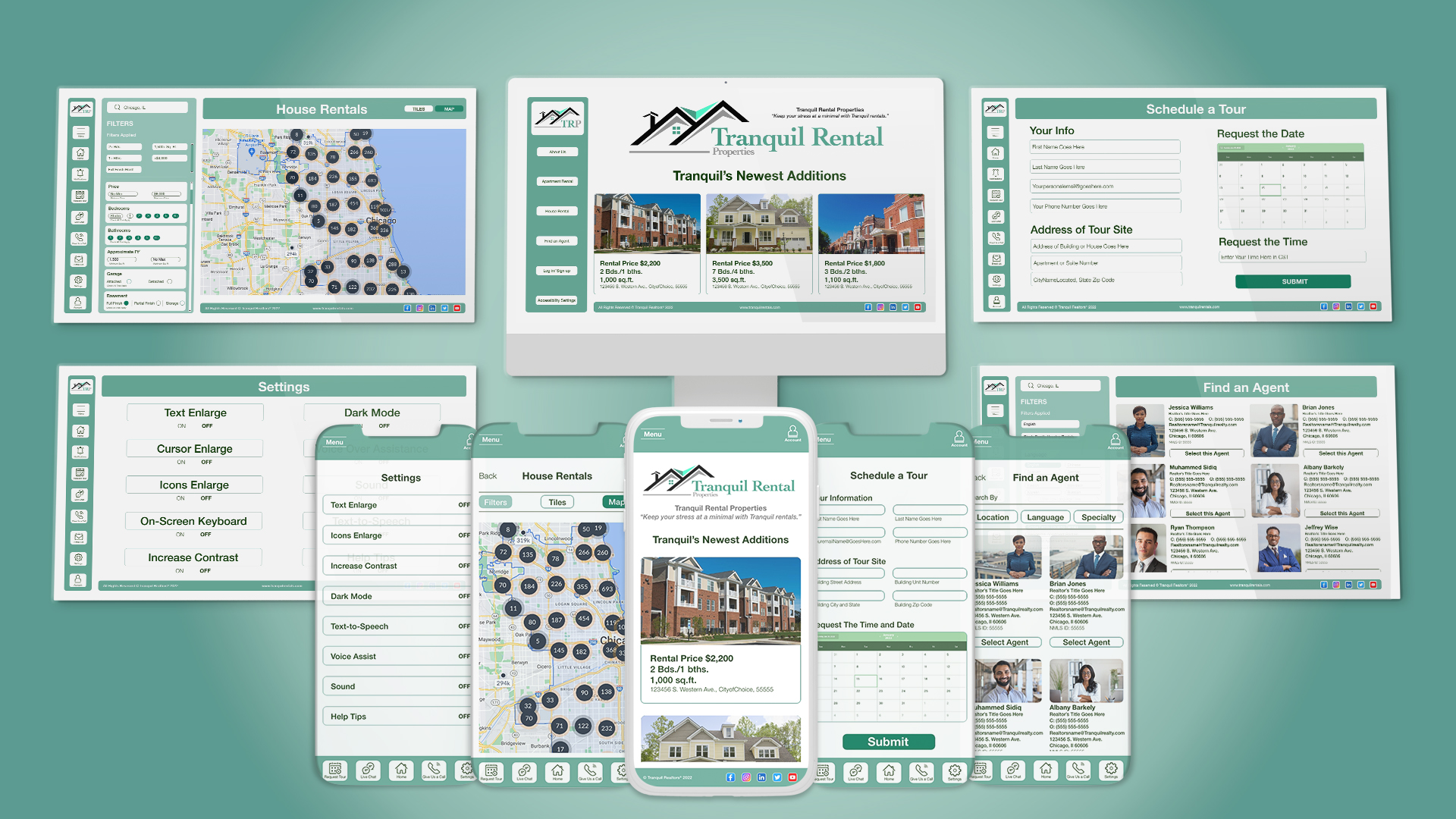
Each page functions as a self-contained flow, reducing decision fatigue and improving findability.

Information Architecture

Digital Wireframes

Summary

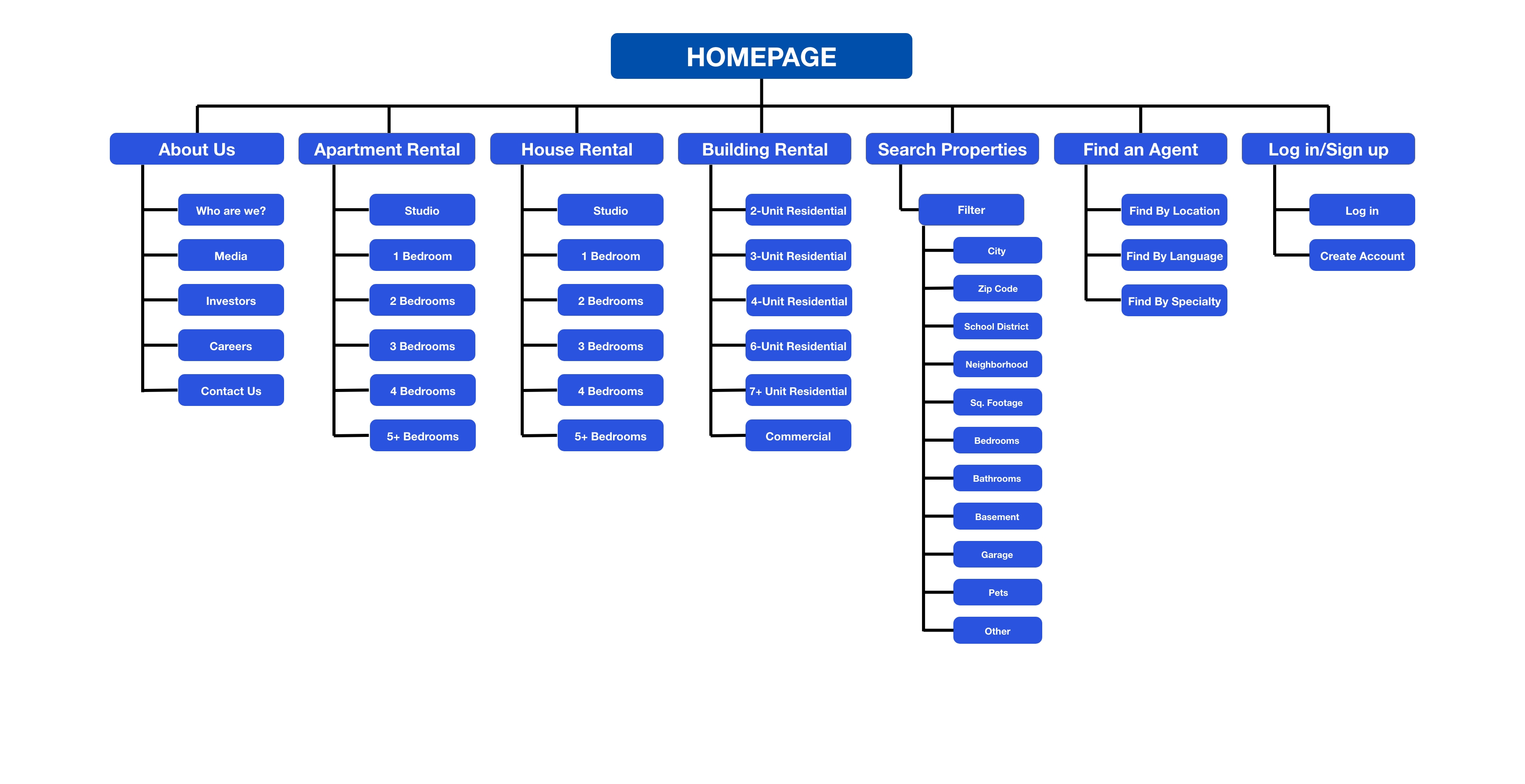
Persistent navigation ensures users always know where they are and where to go next.

Digital Wireframe
Wireframe Prototype

Usability Study

Summary

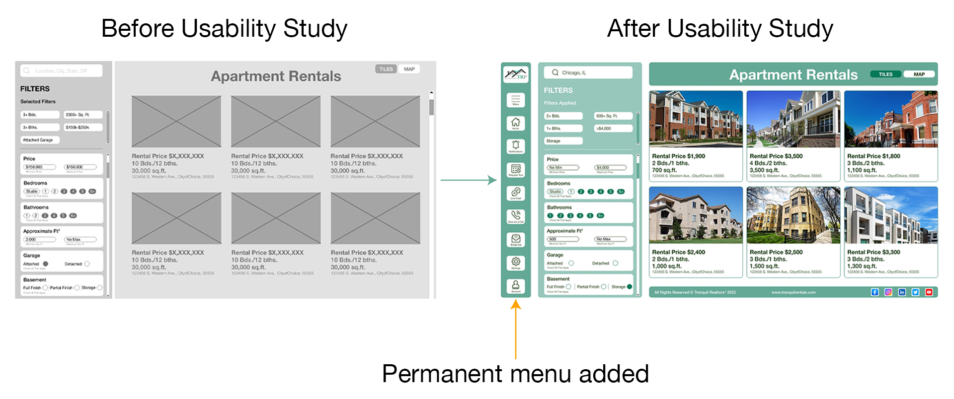
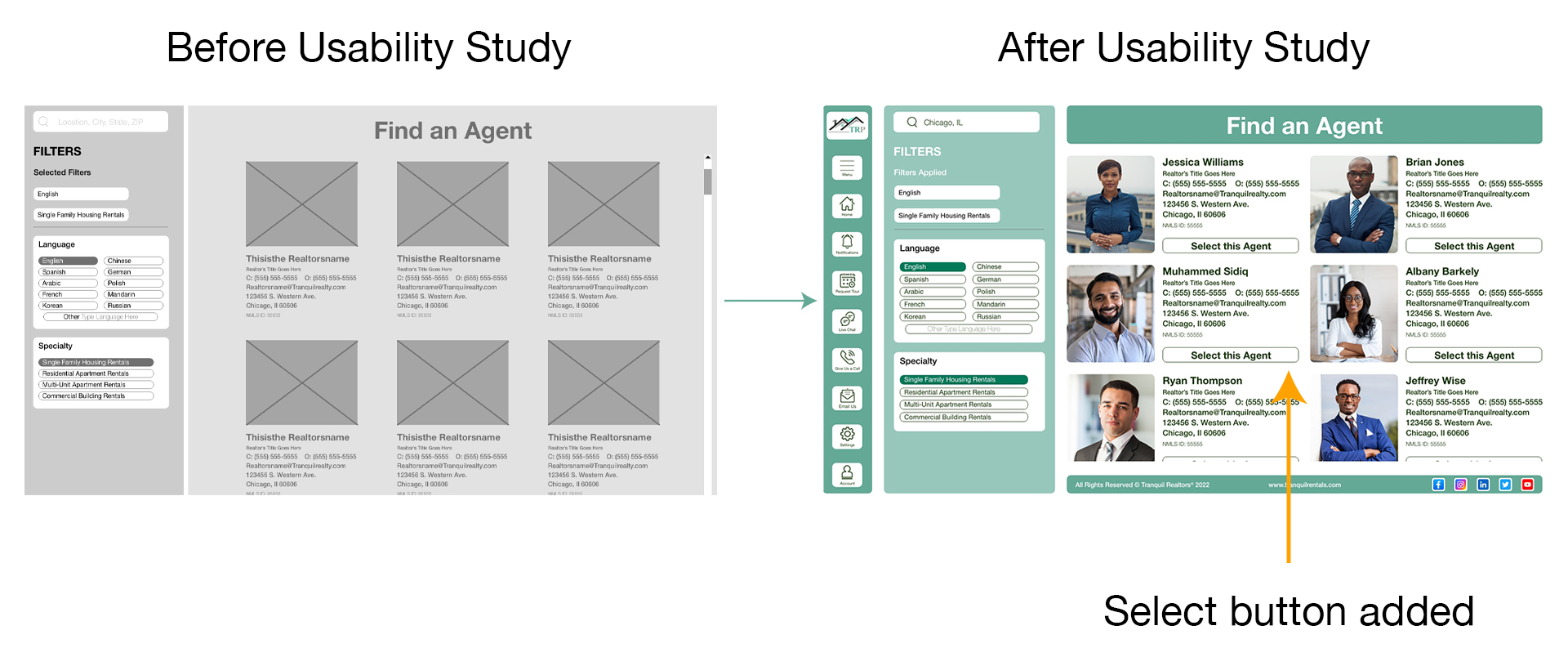
Moderated remote test of the responsive website to observe navigation and task completion.

Study Type

  • Moderated usability study
  • Participants: 5
  • Location: United States (remote)
  • Length: 20–30 minutes

Findings

  1. Users wanted more interaction.
  2. Navigation felt easy to understand.
  3. Desire to save searches.

Visual Aesthetics

Summary

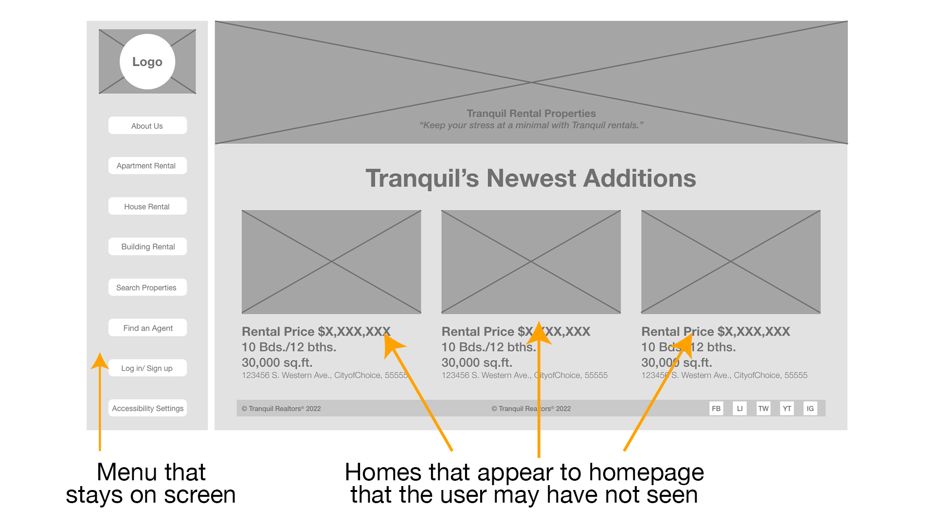
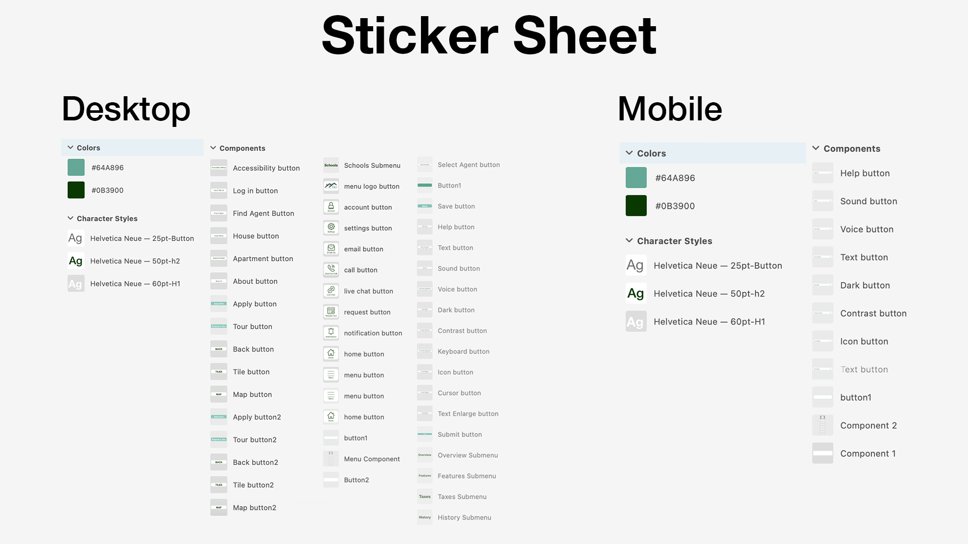
Focused on clarity and inclusivity over decoration.

  • Color: Green palette conveys warmth and trust; varied shades create hierarchy without clutter.
  • Typography: Helvetica for proven legibility and familiarity.
  • Components: Clean, high-contrast buttons that stand out without embellishment.
Sticker Sheet

Mockups

Summary

Permanent sidebar navigation improved usable space and accessibility while keeping wayfinding visible.

Before and After Mockup 1
Before and After Mockup 2

Accessibility

Summary

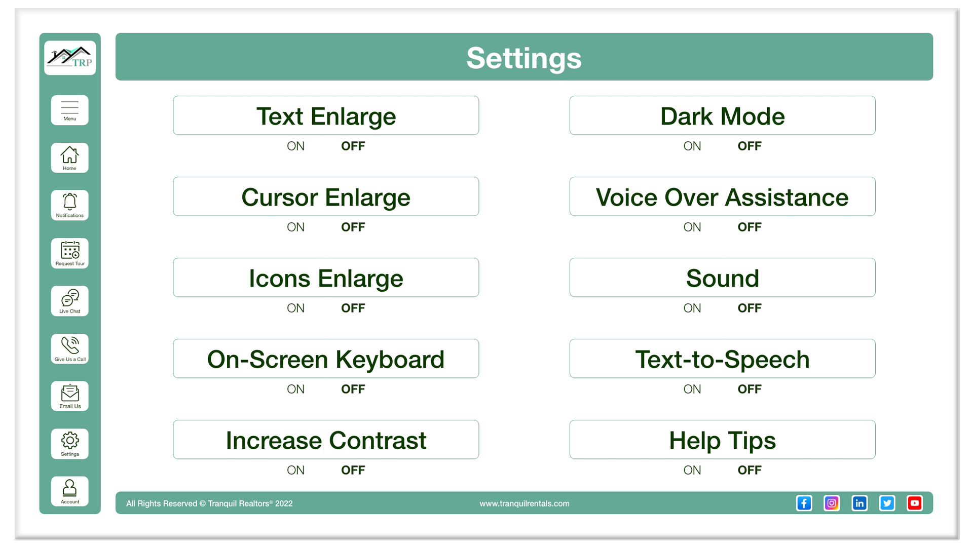
Addressed visual and hearing impairments via settings and strong defaults.

Accessibility Settings
  • High contrast for readability.
  • Settings for audio/visual cues and text scaling.
  • Clear typographic hierarchy.

Final App Mockup

Summary

Designed primarily for desktop and mobile to support common search contexts.

Tranquil Final Mockup

Reflections

  • Impact: Target users found the navigation comparable to—or better than—current leaders.
  • What I learned: Simplicity often increases equity and ease of use.

Next Steps

Run another round of usability testing and expand prototype interactivity for deeper stakeholder feedback.

Thank you for viewing my case study.

Back To Works